How Artists Use Color to Evoke Different Emotions
Embarking on the mesmerizing odyssey of artistic creation, the world of color unfolds as a dynamic and nuanced language. Within the vast canvas, artists emerge as alchemists, wielding brushes laden with the essence of emotions. This comprehensive exploration delves deep into the intricate interplay of hues, uncovering the secrets behind how artists masterfully use color to weave narratives that resonate with profound human sentiments.
Color, beyond its visual allure, is a conduit that transcends the boundaries of spoken language. Artists, like skilled storytellers, navigate the color wheel with precision and purpose, crafting a visual symphony where every shade contributes to the emotional resonance of the composition. As we venture into this realm, we unravel the layers of meaning, symbolism, and cultural echoes embedded within each stroke, discovering how colors emerge as silent architects, shaping the very soul of artistic expression.
The Essence of Color in Art
Color serves as the lifeblood of artistic expression, acting as a conduit for emotions on the canvas. Artists navigate the intricacies of the color wheel, not merely as a visual aid but as a profound language that communicates and evokes sentiments. The selection and blending of colors become a deliberate act of crafting emotional resonance, transforming a blank canvas into a vivid tapestry of feelings.
Understanding color psychology becomes crucial. Warm colors, including reds and yellows, are associated with energy, passion, and positivity. Cool colors, such as blues and greens, evoke calmness, serenity, and introspection. Artists explore the psychological impact of each color, carefully choosing those that align with the emotional narrative they aim to convey.
Color Theory Unveiled
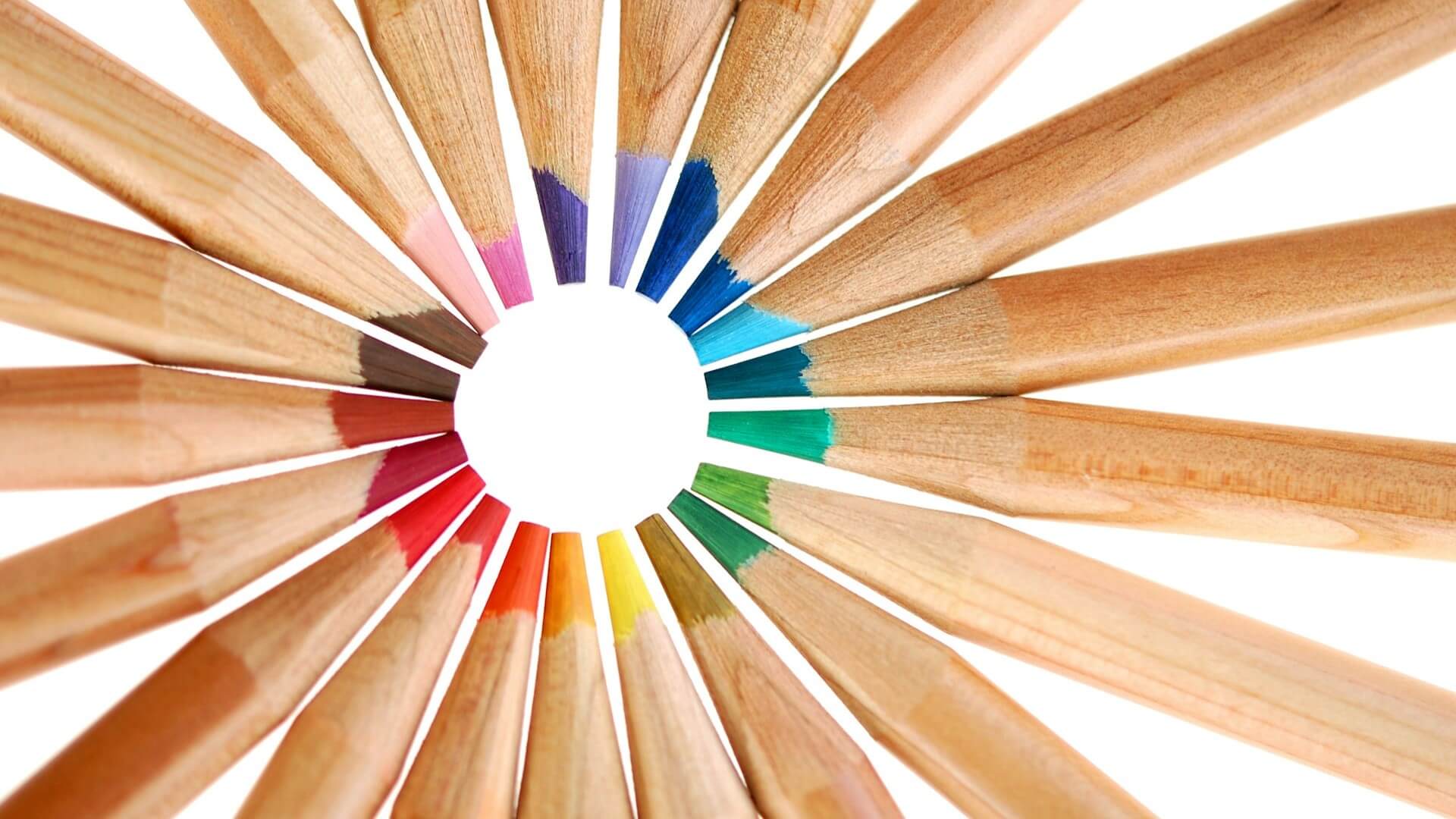
Before the first stroke graces the canvas, artists delve into the foundational principles of color theory. Complementary colors, situated opposite each other on the color wheel, create dynamic contrast, injecting vibrancy into a composition. Analogous color schemes, consisting of hues adjacent to the wheel, provide visual harmony, seamlessly blending tones to elicit specific emotional responses.
Understanding the color wheel’s intricacies allows artists to manipulate the temperature of their works. Warm color palettes infuse pieces with energy and intensity, while cool color schemes create a more subdued, calming atmosphere. By strategically incorporating these principles, artists lay the groundwork for a visual symphony that resonates emotionally.
Warm and Cool Colors
The interplay between warm and cool colors emerges as a dynamic force shaping emotional narratives. Artists strategically position these contrasting elements to create visual tension and balance within their compositions. Warm colors, with their innate vibrancy, ignite passion and intensity, infusing energy into a composition. On the other hand, cool hues establish a serene backdrop, inviting introspection and calmness. Artists skillfully navigate this dichotomy, using the dynamic duo to paint emotional landscapes that resonate with the viewer’s soul.
An in-depth exploration of warm and cool colors reveals their impact on spatial perception. Warm colors tend to advance, making objects appear closer, while cool colors recede, creating a sense of distance. Artists leverage this phenomenon to craft compositions that guide the viewer’s gaze and evoke specific emotional responses.
Symbolism Beyond the Spectrum
Colors transcend their visual appeal, assuming symbolic significance laden with cultural and emotional meaning. The artist, as a storyteller, infuses each stroke with intentional symbolism, creating layers of meaning within their work. The red canvas pulsates with the vitality of love or danger, while the blue expanse breathes tranquility and depth. Artists become language creators, using colors as words to convey nuanced emotions and cultural messages.
The exploration of color symbolism extends to cultural contexts. Red, often associated with love and passion in Western cultures, holds different connotations in Eastern cultures, where it may signify luck or celebration. Artists navigate these cultural nuances, ensuring that their use of color resonates universally while respecting diverse cultural interpretations.
The Art of Contrast and Emphasis in Color
The contrast becomes the maestro’s baton, directing the viewer’s gaze and creating impactful compositions. Through variations in hue, saturation, and value, artists sculpt contrast, guiding the eye to specific elements within the canvas. The interplay of light and shadow, masterfully painted with a judicious selection of colors, shapes the emotional narrative with precision and finesse.
Artists employ techniques such as chiaroscuro, the use of strong contrasts between light and dark, to create dramatic effects. By strategically placing contrasting colors adjacent to one another, they draw attention to focal points within the composition. This deliberate use of contrast becomes a powerful tool for shaping emotional responses and emphasizing key elements.
Crafting Emotional Resonance through Color Harmony
Color harmony is the invisible thread that weaves through the fabric of a masterpiece. Artists draw upon various color schemes – from monochromatic palettes dominated by a single color to triadic arrangements that balance contrasting hues. This intentional crafting of harmony ensures a seamless visual journey that resonates emotionally with the viewer.
Exploring color harmonies involves a careful consideration of the relationships between colors. Monochromatic palettes, consisting of different shades of a single color, create a sense of unity and simplicity. Triadic color schemes, utilizing three evenly spaced colors on the wheel, provide balance and visual interest. Artists employ these techniques to evoke specific emotional responses while maintaining visual coherence.
Colors in a Global Context
In the mosaic of artistic expression, colors bridge cultural divides. Artists, sensitive to the nuances of cultural tapestry, incorporate both universal and culture-specific color associations into their work. This nuanced approach transcends borders, allowing artists to communicate emotions universally while acknowledging and respecting the diverse cultural perspectives that shape individual responses to color.
The exploration of cultural influences on color extends beyond symbolism to preferences and perceptions. For instance, while red may symbolize love in many Western cultures, it is also prominent in traditional Chinese celebrations, representing good luck and prosperity. Artists navigate these cultural nuances, enriching their work with layers of meaning that resonate with a global audience.
The Shifting Embrace of Color
Art is a living entity, breathing and evolving with the changing play of light and space. Artists leverage the temporal and spatial dimensions of color to manipulate emotional resonance. The shifting hues under natural or artificial light create a dynamic interplay, inviting viewers to experience the emotional narrative in different contexts and perspectives.
Understanding the effects of light on color perception becomes essential. Natural daylight casts a warm, yellow-toned light, while artificial lighting sources may introduce cooler or warmer tones. Artists consider these factors, anticipating how their work will be experienced in various lighting conditions. Additionally, the spatial arrangement of colors within a composition influences the viewer’s perception of depth and perspective.
The Emotional Depth of Color
As artists plunge into the emotional depths of color, the canvas becomes a portal to shared experiences. Layers of meaning, cultural echoes, and subtle nuances emerge, inviting viewers to engage in a profound dialogue with the artwork. Here, within the brushstrokes, color transcends its visual form, becoming a conduit for shared emotions, understanding, and a universal connection that goes beyond words.
The emotional depth of color is intricately tied to the artist’s intent and personal expression. Artists infuse their works with personal experiences and emotions, creating a symbiotic relationship between the color palette and the narrative. Viewers, in turn, bring their own emotions and interpretations to the artwork, contributing to the richness of the shared experience.
Conclusion
In the hands of artists, color transcends its visual form to become a symphony of emotions echoing within the hearts of beholders. From the intricacies of color theory to the intentional use of symbolism, contrast, and harmony, artists masterfully weave narratives that resonate on a profound emotional level. Spectators transition from mere observers to active participants in this visual dialogue, discovering a shared language where colors speak directly to the soul.
The exploration of colors is not merely a study of pigments on a canvas; it is an unveiling of shared experiences, cultural richness, and the depth of human emotion. Each brushstroke becomes a note, and every composition is a chapter in the evolving story of human experience. As we stand before a masterpiece, we are not merely witnesses but contributors to a timeless expression that transcends boundaries, inviting us to explore the vast and intricate tapestry of our own emotional landscapes. In the realm of art, the power of color to evoke emotions is an ongoing symphony, where artists continue to paint the canvas of human experience with the nuanced and resonant hues of the heart.